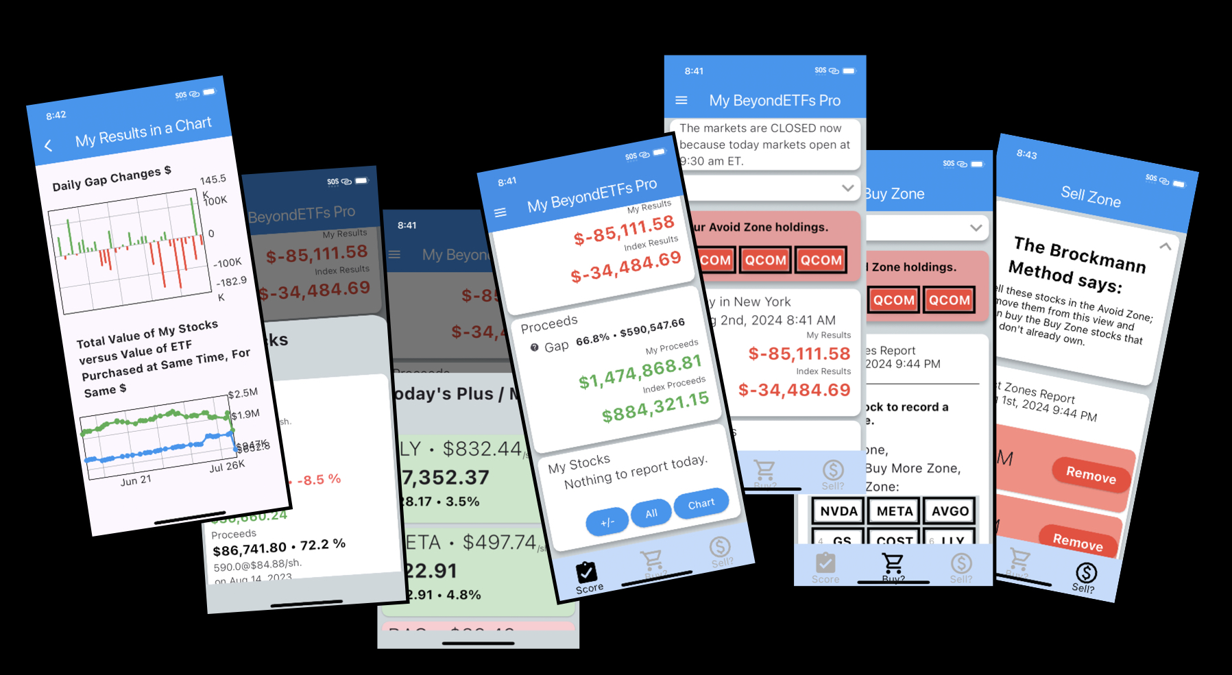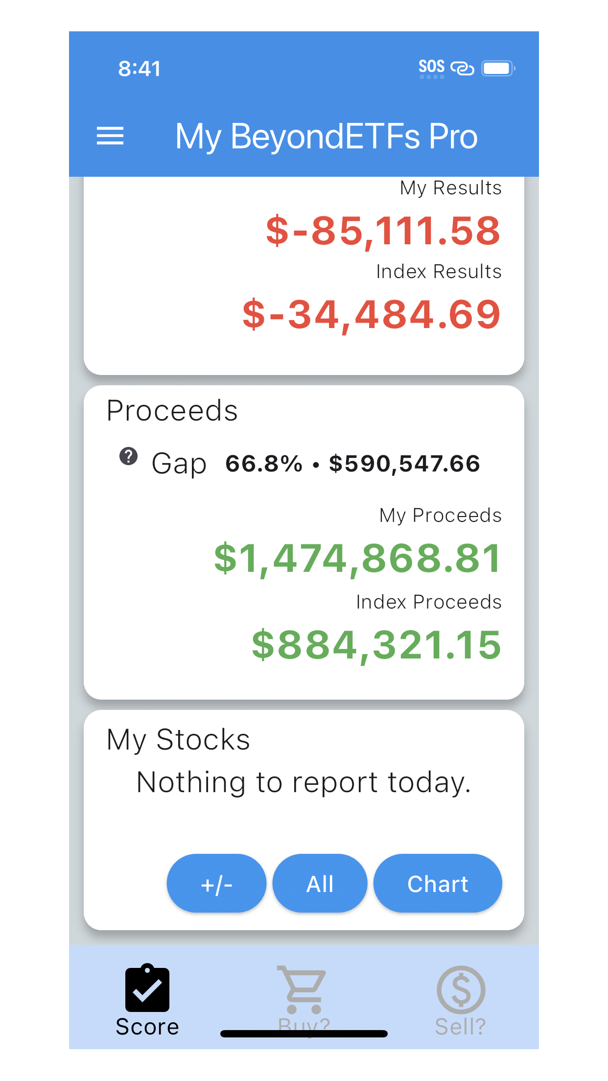
Besides the obvious Scorecard, the top of the app features a navigation menu, indicated by the three horizontal bars on the top left. This opens a window of actions including Profile, EULA (and Privacy Policy), News, Settings, Store Review, Feedback, Support, Logout and Delete Account.
However from the main view, BeyondETFs Pro features a simple user paradigm – the tab bar – that emphasizes the three core features of the product.
- a Scorecard – that is the home of the app showing off the value of your portfolio versus the Index purchased for the same $ on the same day, today and for all time.
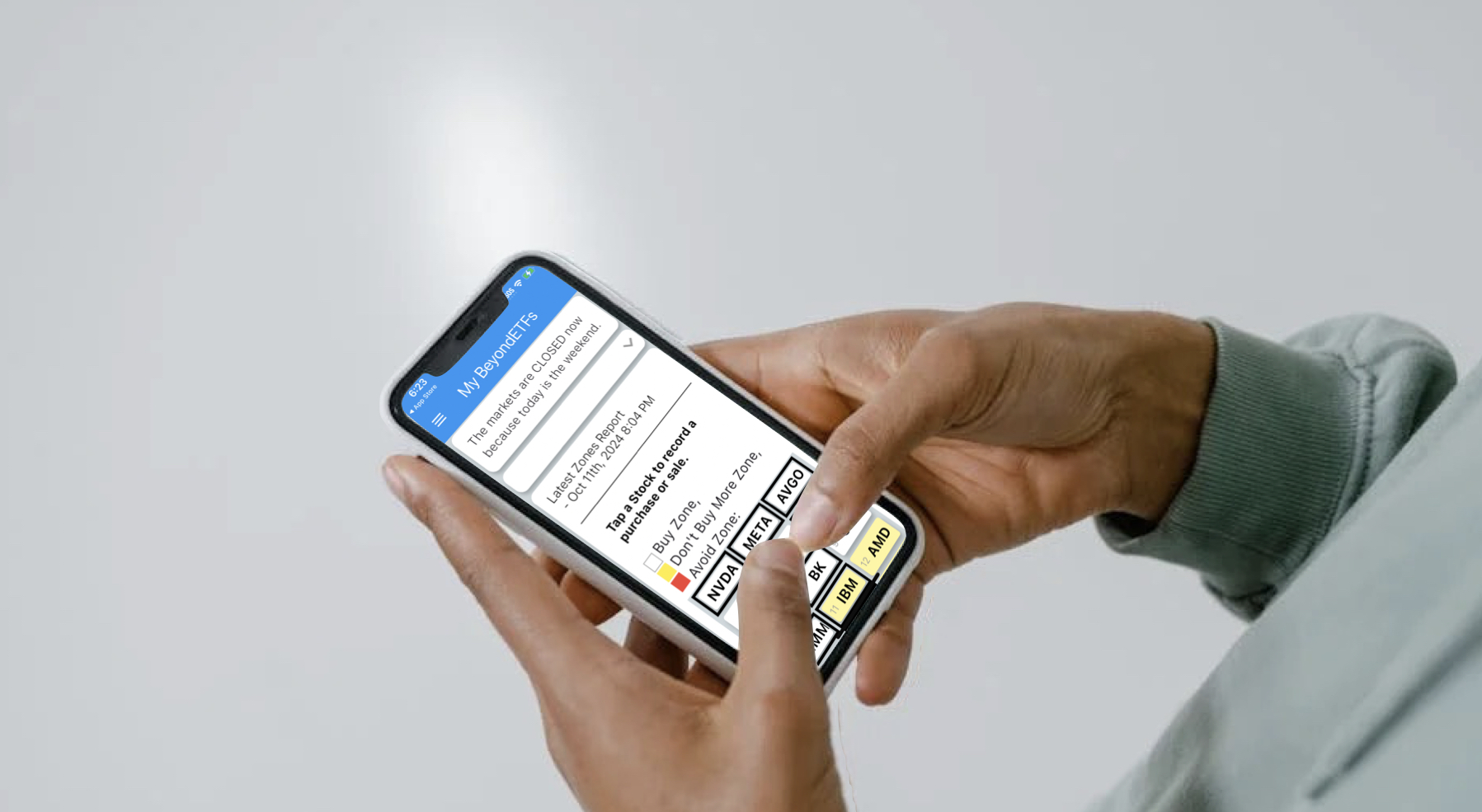
- a Buy tab – showcasing the S&P 100 stocks organized into the Brockmann Method’s Buy Zone, Don’t Buy More Zone and Avoid Zone, and indicating the stocks you own with a solid black bar around the cards. Tapping the stocks brings up a details form that captures quantities, price and date purchased.
- Sell tab – which gets involved whenever you need to extract some cash from your portfolio, or if a stock you own falls into the Avoid Zone which signals that it is time to sell that stock. There are better opportunities waiting at the top of the Buy Zone.
The goal of the product is similarly three-fold. The Scorecard constantly reminds you of your score compared to the Index, so that you know that you’re beating the Index (or not). It also is home to important related analyses for today’s plus/minus by stock, all time state of each transaction and a graphical representation of trends. The Buy comes in handy whenever you need to know ‘what to buy‘. The Sell tab, as the name suggests, is designed to handle the tasks necessary whenever the app tells users that it is ‘time to sell.’ It is also useful when you have to sell something to achieve your personal goals.
