How else can we collapse the views of hundreds and thousands of customers into actionable information, into real customer insights? We use online surveys but are careful to avoid these common errors.
Avoid Matrix Fatigue
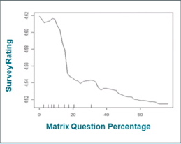 In a recent webinar sponsored by MarketTools, several important instrument design considerations were highlighted. The presentation was full of common sense instrument design considerations and had awesome research to back it up.
This graphic, for example shows that as matrix questions get to more than 15% of the question count, the satisfaction with the survey drops. Thats because survey takers get tired with repetitive questions and lengthy matrix questions are particularly notorious for draining one’s survey taking energies. Of course, Matrix Fatigue increases dropouts, accelerated and skipped questions and can bias samples and therefore make results less reliable in their conclusion.
Use Pages and Progress Bars
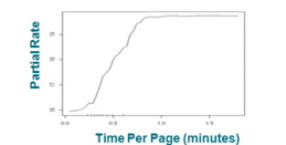 Likewise, too many questions on any one page significantly increases the risk of skipped questions and incomplete answers. In this graphic we see this intuitively obvious problem represented graphically: as a survey taker is presented with too many questions, the rate of question skipping (aka partial rate) increases. Survey takers are conditioned to expect a page of questions to take only so many minutes, and when the density of questions exceeds that perspective, they tune out and skip questions.
The other requirement is to keep users aware through some kind of progress bar, how far they have come and how far they are to go. Not knowing how far is left simply discourages one more page to completion for even the most conscientious survey taker.
Abandonment
However, the ultimate failure in survey instrument design is abandonment rate. Survey takers are sufficiently interested in the invitation and preamble to actually invest in beginning to take the survey. But, sadly, as they progress, the![]() y become bored, preoccupied or so frustrated with the questions or the length of the survey that they quit before completing it.
y become bored, preoccupied or so frustrated with the questions or the length of the survey that they quit before completing it.
Generally, if the gap between the percent of users starting the survey and those finishing the survey becomes more than say 10%, our experience tells us that there are problems with the design. Perhaps there are questions that don’t technically make sense, so users are confused and then frustrated. Perhaps there are questions that are asked more than once. Perhaps there are too many matrix questions. Perhaps there are too many pages. Perhaps the instrument is too long. Perhaps, the survey asks detailed questions that are uncomfortable to answer before survey takers are comfortable or trust the survey analyst.


